
Icon do’s and don’ts: What you need to know before incorporating icons in your next project
Icons often get overlooked. This is probably because their job is a thankless one: Enhance the content without being too distracting. After all, your audience wants to be able to get information as quickly as possible and an overly-complex and beautifully detailed illustration can often distract rather than help. When it comes to icons, they tend to discreetly enhance a layout rather than be the belle of the ball.
(Not sure what the difference between an icon and illustration is? Check out our article.)
So why should you use icons?
Icons are a functional and important part of any marketing piece or website. Being functional doesn’t mean they can’t be beautiful, but icons need to remain simple and, most importantly, clear. Icons are used to quickly draw attention, clarify copy, or point a customer to a certain action or goal.
Icons are also a great way to save on space, particularly for mobile devices where space is at a premium. Think about crazy-long navigation menus. Not great for cramming onto a mobile screen, right? To circumvent this issue, UI and UX designers rely on the beloved “hamburger” menu (three lines stacked on top of each other). Tap the simple three-bar icon and it reveals the navigation menu that, without the collapsible menu, would have cluttered the screen. The adoption of this icon initially grew from the necessity of needing space on mobile and has since found its way onto larger desktop screens (a practice that is widely debated by UX experts to this day).
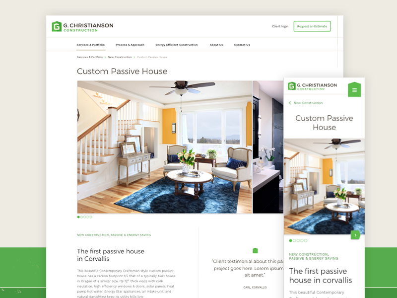
On Desktop, the main navigation is clearly displayed. On mobile, where space is limited, the main navigation is placed under the “hamburger” icon.
Same idea with the good ol’ “search” icon. Rather than have a box that says “search,” which is perfectly acceptable for the large real-estate of a desktop screen, a simple magnifying glass works for mobile and is a widely understood space-saver.
But don’t forget, if you can say something simply with words, maybe an icon isn’t needed. Yes, they can be very useful, but when used inappropriately they can cause visual noise. Don’t put icons on a page just to have icons. Make sure they have a purpose.
So when should you use icons?
First, think about what your icon is being used for. An icon can take many different forms: Is it an icon supporting an important piece of content? A social media icon? An icon that is universally understood? An icon calling for an action, such as “play” or “refresh?” Is it a Favicon (those handy little icons you’ll see on the tab associated with your website in your browser window)? Each icon needs to be treated differently depending on its purpose.
Icons that support copy
Let’s say you have a brochure with a lot of copy. It’s a marketing piece that explains the exciting breakthroughs your company has been involved in. Problem is, the customer is confronted by a big wall of text. That’s not very exciting or interesting.
Icons can be a great way to break up large amounts of text while giving the reader insight as to what they will learn before diving in. In cases like this, icons can be a little more detailed than, say, an icon that is trying to quickly direct you to an action (more on that below).
For example, if a customer sees an icon of a briefcase on your site, they will likely assume it is indicating something about “business” or “work.” Based on common icon conventions, it is quickly understood and there was no need to waste a bunch of verbiage to get the point across. If, however, the icon is supporting a complex idea put forth in the text, it may need another level of detail. This could be a briefcase on top of a globe with a heart over it. Unlike the simple briefcase icon, its purpose is not quite as clear without the text and yet it still needs to be quickly understood. When this happens, a clear title can tie the icon and copy together. Something like “promoting good business across the world.”

When icons support copy, it’s best to have a clear title to tie the two together
Above is an example of more detailed icons supporting copy. These are a great way to elevate the message on the page. They draw the reader’s eye in, and quickly support the copy in a simple visual way.
Social media icons
Ah yes, the ever-ubiquitous social media icon. Found on almost all websites and marketing materials, these icons are great indicators of a broader social media presence. There are, of course, the familiar social media icons such as Facebook, Instagram, or Twitter. In this case, check out the media kits and licensing provided by these companies. Often the icon files are free to download, but keep in mind you often cannot change their color (unless it’s black or white) or the icon itself. Let’s face it, you probably wouldn’t want someone changing your logo icon either. So, stick with the rules.
But let’s talk about creating your own icon for social media use. When creating an icon for application on various social media platforms, keep in mind it needs to be flexible and simple. Often icons for social media are designed in the shape of a square with ample room around the corners, since, depending on the social media platform, your logo icon could either be placed in a square, a square with rounded corners, or a circle. It’s also going to be viewed at large and small sizes, so this is where the simple part comes in. An overly complex icon is not going to be very recognizable in a Facebook newsfeed on your phone.
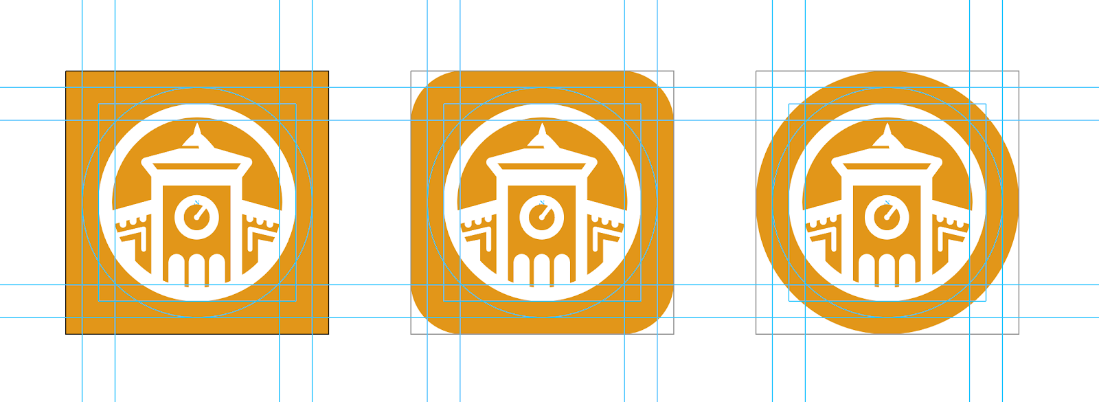
Social media icons need to fit a variety of shapes
That said, social media icons are used for just that… social media applications. Whether they are linking TO a social media application, or it’s the appearance of your icon on the app itself, simplicity is key.
Universal icons
Icons can be used to resonate with a global audience when words can’t effectively reach such a broad group. Think about street signs across the world. Without knowing the language, you can clearly understand a warning or message. Same idea applies to a marketing piece or website. If a user sees a magnifying glass on your site, it is universally understood that means “search.” This doesn’t mean, however, that all icons work for a global audience. A great example of this is referenced in a Creativebloq article on icons:
“… in the West an owl stands for wisdom, while in the East it’s a symbol of stupidity. Poor old owl.” — Ruth Hamilton, Creativebloq
In fact, few icons work universally. Think about the Shopping Cart. Seems pretty universal, right? Wrong. That cart is also often represented as a bag, or even a basket. Same goes for the “heart” icon. It can mean “favorite, ” “love,” or “save,” which makes it difficult to understand right off the bat. On top of that, “favorite,” “love,” and “save” can also be represented as a star. When using icons, do your research. What will make sense to your audience? Is it really universal?

The cart, the shopping bag, the basket … not all icons are universal.
Icons that imply an action
Found everywhere on the web, these are icons that hint at an action the user needs to take. Generally these are universal icons and therefore understood around the world without labels or introduction. A great example of this is the “play” button. Quickly understood and recognized, the “play” button just needs one click or tap, and the user knows that a video or song will start playing. The action is already implied in the icon. Another example is the “home” icon. Click on that icon to get “home.”

Icons like the “play” button easily point a user to an action
While these icons can exist without labels, it is wise to consider adding labels when you can for the sake of ADA compliance and overall clarity.
Favicons
Favicons are a subtle icon that can solidify the branding of a web page. Take a look at the page tabs at the top of your browser window. See all those little icons next to the page title? That’s a Favicon. Favicons are a subtle reminder of where you are, especially if, like me, you have about 15 tabs open at any given time. Favicons also appear in your bookmarks bar as well as the icon that appears when you save a site to the home screen on your phone.

Although small, the Favicon can help tie a site’s branding together
A nice cherry-on-top for any website, the Favicon can often get overlooked. A Favicon is actually a collection of many different sizes of icons, used for a variety of devices. There are a couple of ways to approach the Favicon. First, there is the ICO file. An ICO file contains multiple files, all set up to conform to the multiple applications needed for the Favicon. This method works great because all the files needed are contained in one tidy ICO file.
The other option is to save the multiple files yourself or via a generator. Often, my approach is to create a high-quality PNG (in a 64px x 64px square). I then use a favicon generator that takes this PNG and saves it in the 24 sizes needed to appear in bookmarks, URL bars, tabs, and Apple and Android screens. A nice added bonus to this latter method is I can take a few of these files and customize them to be more ideal for their application. Sometimes an image that looks great in a tab won’t work as well as the icon on your Android or iPhone home screen. This flexibility makes this my preferred method of creating Favicon files.
Clearly icons have a variety of ways they can be used. On top of determining which kind of icons you need and why, you need them to match the look and feel of your brand.
What if you want your icons to look special?
There are vast banks of pre-created icons. Whether they are free or charge a fee for use, these icons can be an excellent time-saver for a quick print or web piece. The key is making sure these icons remain consistent throughout as you pick and choose icons that suit the messages you are trying to convey. Or, if you have a designer handy, they can take these icons and adjust them as needed. Not too shabby. Below are a few resources for free icon sets, just be sure to check licensing and crediting:
entypo.com
thenounproject.com
flaticon.com
Often, however, there isn’t an icon that quite matches the message your piece needs to convey in those pre-made sets. Or maybe you have a very particular look you are after in order to match your overall brand. Or maybe your competitor is using the same free icon set (yikes). In such instances, custom is the way to go.
When thinking about custom icons, consider if you need just a couple icons, or an entire icon set. A few icons? Okay. A designer can create a few for your brochure or web page and you are on your way. But what about future print pieces? Future web pages? It might be a good idea to have a repository of icons custom-made to suit all of your business needs for present and future work.
While creating an entire custom icon set is a large chunk of work, it can be a time-saver in the long-run. Any future marketing pieces or presentations already have a ready-to-go repository of icons. This allows for brand consistency and ease-of-use for employees.
Next time you find yourself perusing a website or printed marketing piece, take a moment to look at the icons. Are they clear? Are they consistent? Are they taking too much away from the content on the page? How are they enhancing the content? Are they distracting? See what is working and what is not. Chances are, you didn’t look all that closely at the icons before, but now you can see the subtle brilliance of a good icon set. Even better, you can apply these insights to your next marketing piece or website.
More Resources
-
Article
Safeguard Your Investment: the 411 on Accessible DesignHow can an organization truly serve the public if they can’t reach the whole public? In the U.S., one in...
-

Article
How to Win Over Riders with a Better Digital Transit ExperiencePublic transportation keeps our cities moving, connecting people to their jobs, schools, and favorite hangout spots. As urban areas expand...
-

Article
Checklist of Federal and State Requirements for Developing an Accessible Website in TexasUnderstanding accessibility Designing a website that’s “accessible” means you’re providing an equivalent experience for all users, regardless of the physical...


