WCAG 2.2 Guidelines – What’s New
The Web Content Accessibility Guidelines (WCAG) exist to help web developers and the organizations they serve to be as inclusive as possible. As of August 2023, these guidelines have been updated to a 2.2 iteration (from the current 2.1 version). The update introduces nine new success criteria and presents opportunities as well as important implications for our clients across the public transport, education, community health, and early childhood learning sectors. In this article, we’ll provide simple explanations and clear reasoning for the changes as well as use-case examples.
These new criteria fall into three broad categories: 2.4 Navigable, 2.5 Input Modalities, 3.2 Predictable, and 3.3 Input Assistance. Let’s dive in.
Note: The A, AA, and AAA designations indicate increasing degrees of accessibility, with A representing the bare minimum and AAA being the most comprehensive. Meeting AA criteria tends to be most realistic for most web content (and the most frequently cited when legal action is taken). It’s a good general standard.
Guideline 2.4: Navigable
2.4.11 Focus Not Obscured (Minimum) (AA)
This one is straightforward: when an item receives keyboard focus (remember, many disabilities prevent people from using a mouse), it remains visible and is not obscured by other content. For instance, pop-ups, overlays, or sticky elements should never cover the current focus of the user.
In practice, for one example, users on a community health site should be able to fill out a form without tooltips or hints covering up their ability to see/sense what they’re typing.
Guideline 2.5: Input Modalities
2.5.7 Dragging Movements (AA)
Your website should provide alternatives to any actions that require clicking and dragging. For instance, instead of dragging an item to a cart, there could be a ‘click to add to to cart’ option. This is less common on most sites, but if your site offers interactive educational ‘games’, it may be an issue.

2.5.8 Target Size (Minimum) (AA)
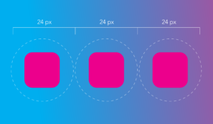
This criteria asks that interactive elements, like buttons, either be of a minimum size or have enough spacing around them (the specifics can be found on the WCAG website). This ensures they can be easily tapped or clicked on any device. This helps people who may not be able to click or tap as carefully as others to make fewer mistakes in navigation. For community health providers, this could mean ensuring that a symptom checker tool has buttons that are large and spaced out.
Guideline 3.2: Predictable
3.2.6 Consistent Help (A)
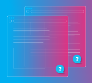
You may already have a tooltip, help icon, or visitor chat option on your website—though few websites have them on every page in the exact same place. That’s what this guideline is for: ensuring that any help mechanisms are consistently placed across pages. For education sites, this could mean always having the ‘support chat’ in the bottom right corner of the student portal pages.
Guideline 3.3: Input Assistance
3.3.7 Redundant Entry (A)
This guideline aims to minimize the chance of user errors and reduce the need for users with cognitive disabilities to remember information. The long and short of it is to try to avoid asking users to enter the same information multiple times.
For instance, if a user has already entered their shipping address during a checkout process, they shouldn’t be asked to re-enter the same address for billing unless it’s different. Re-entering the same information can be tedious and prone to errors, especially for those using assistive technologies. On early childhood education websites, parents shouldn’t have to enter their emergency contact information multiple times if it can be opted to carry over from earlier inputs in the program registration process. For community health, patient portals should avoid asking numerous times for a patient’s medical history if it can be auto-populated.
3.3.8 Accessible Authentication (Minimum) (AA)
When you log in to a site for which you have an account, you’re often asked to verify your identity through a CAPTCHA process or other ‘test’ to ensure you’re a real person and not a threat. Surprise, surprise: tests that rely on visual accuracy (finding the backwards number in a set or looking for the pink motorcycle) are punishing for the dyslexic or visually impaired. Others that rely on memorization are unfair to those with memory-related disabilities.
How can you fix this? There are a few options:
- Offer audio CAPTCHA as an alternative
- Offer multiple authentication methods
- Allow auto-fill and copy-paste for passwords
You’re all caught up!
The WCAG 2.2 guidelines, while highly technical in nature, are fundamentally about people. They exist to ensure that everyone, regardless of their abilities, can access and benefit from the services you provide. For sectors like public transport, education, community health, and early childhood development, these aren’t just guidelines—they’re a roadmap to a more inclusive future.
Of course, we don’t expect you to figure this out and make these updates all on your own—that’s why MAC exists. We’ve always stood for a more inclusive neighborhood, so if you’re looking for assistance with WCAG compliance on your website, contact Logan Hoffman at logan@madcollective.com.
More Resources
-
Article
How to Build an Accessible Public Transit WebsiteIf you work in public transportation, it’s likely you’re no stranger to the concept of accessibility standards. With 97% of...
-
Article
Checklist of Federal and State Requirements for Developing an Accessible Website in OregonUnderstanding accessibility Designing a website that’s “accessible” means you’re providing an equivalent experience for all users, regardless of the physical...
-
Article
Checklist of Federal and State Requirements for Developing an Accessible Website in CaliforniaUnderstanding accessibility Designing a website that’s “accessible” means you’re providing an equivalent experience for all users, regardless of the physical...


